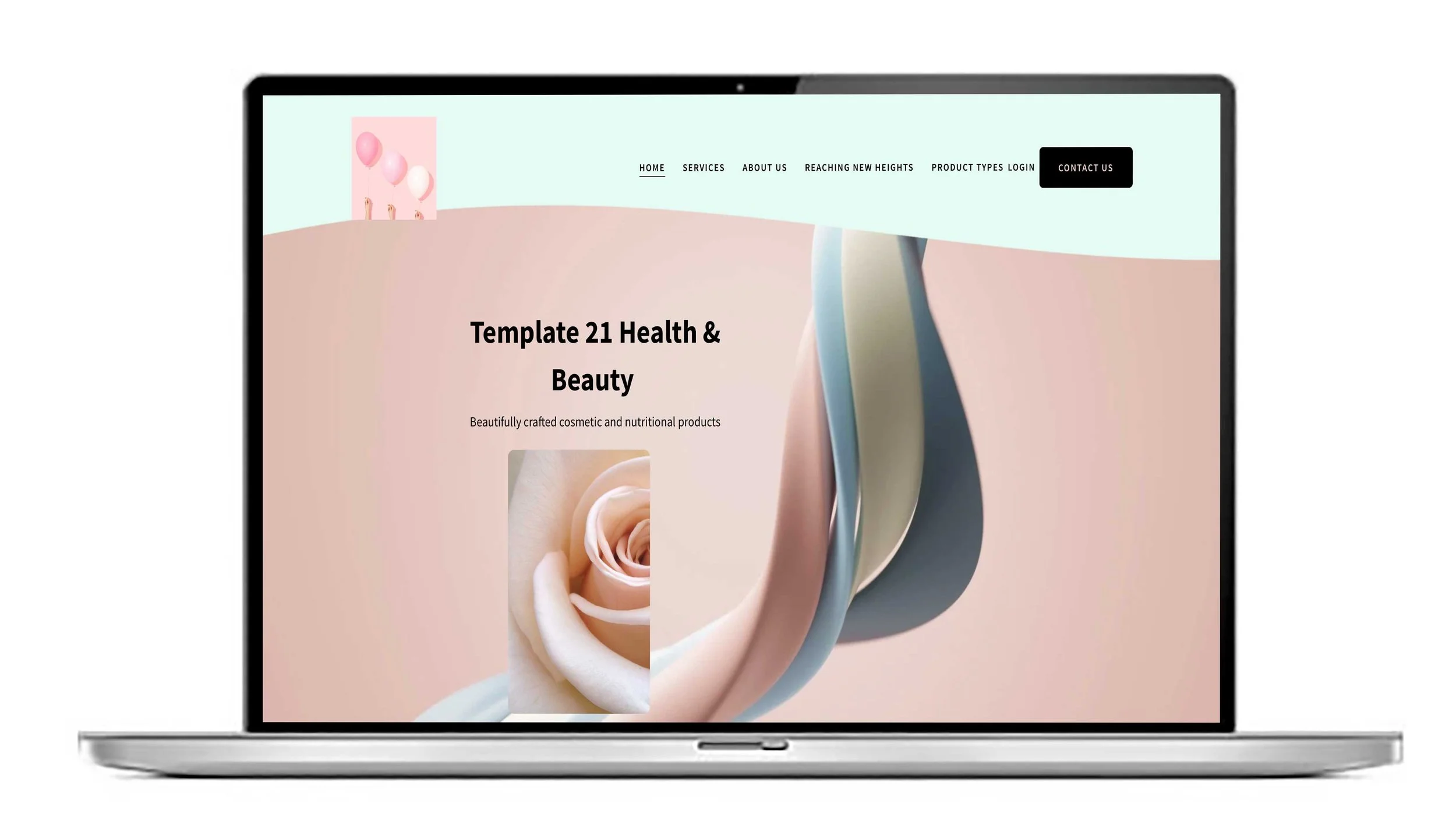
Squarespace website help UK. Button styles and how to change them.
Buttons signify a call to action on your website page and it helps get your user to the page or function they need. Google can tell if your website is engaging and if your bounce rate is high it may mean your calls to action aren’t clear. The button types help you establish a clear visual hierarchy for your site's calls-to-action.
Primary: Used for the most important action you want visitors to take, such as "Buy Now" or "Sign Up".
Secondary: Can be used for less critical, or transitional, actions, like "Learn More".
Tertiary: Often used for the least prominent actions, such as a simple text link.
Impact on your site:
Primary button styling affects most system-generated buttons across your site, including those in the header, forms, checkout pages, and auto layouts.
Secondary and Tertiary styles are used for button blocks that you manually assign to those types.
How to customise button styles
Open Site Styles: While on any page, click the paintbrush icon in the top-right corner to open the Site Styles panel.
Navigate to Buttons: Select Buttons, then click the arrow next to the button type you want to edit: Primary, Secondary, or Tertiary.
Adjust design elements: In the editor, you can change the following settings for each button type:
Text: Set the font, style, weight, and letter spacing.
Shape: Choose a button shape like Square, Rounded, or Pill, or select from other options like Underline or Leaf. You can also choose between Fill (solid background) and No Fill (outline).
Padding: Adjust the horizontal and vertical space between the text and the button's edge.
Set button colours: Button colours are managed separately under the Colours panel in Site Styles.
Select the specific colour theme for the section containing your button.
Click the pencil icon to edit the coloors for that theme.
Scroll to the Buttons section and set the text and background colours for your Primary, Secondary, and Tertiary buttons.
Fit vs. Fill options (for 7.1 websites)
For sites using 7.1 or Fluid Engine, you can choose how your button block behaves within its container.
Fit: The button resizes to fit the text inside, using the padding settings you defined in Site Styles. You can align it to the left, centre, or right.
Fill: The button stretches to fill the entire column or content block it occupies, which is useful for creating bold, full-width calls-to-action.
We love to chat. Call us 9am-9m Mon-Sat 020 8333 0151 if you need help or advice.


