

Best Squarespace Website designs for Designers: Our Top Pick
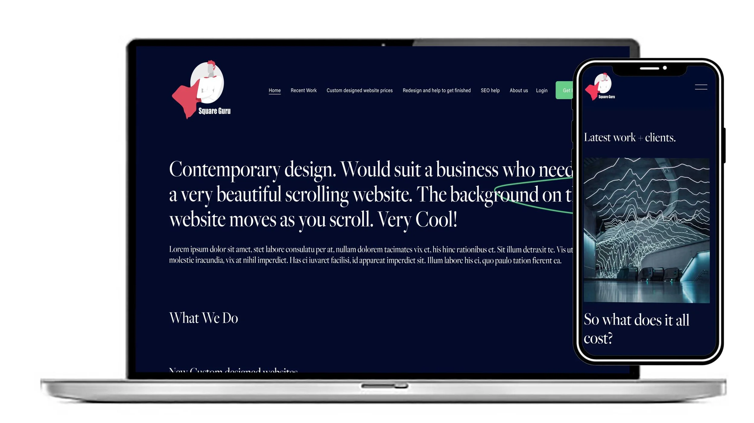
Our Scrolling Template is a Squarespace template aimed at creative brands that want to stand out. It’s one of our more visually distinctive designs, rather than a conventional static business template. The Clouds template below is a similar style to the Scrolling template.
View this design
Similar design to The Cloud template. This is a scrolling design. Would suit any business that needs to stand out in a crowded market.
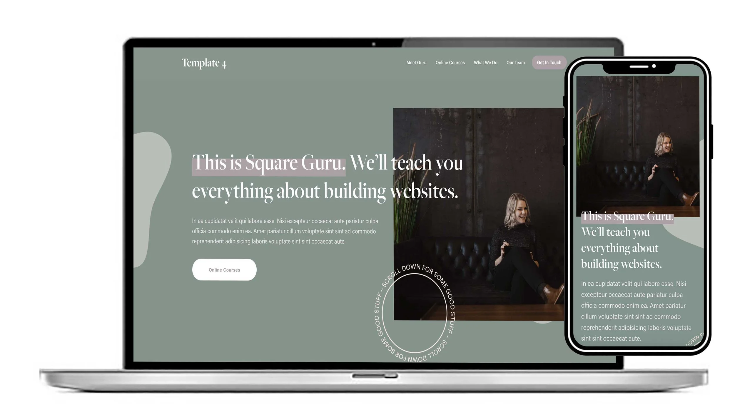
Very cool scrolling website where the backgrounds move independently from the page foreground. Would suit a business that needs a gorgeous design.
View this design
What makes this Scrolling template distinctive?
Scrolling/parallax-style presentation: The design uses a scrolling effect where background elements move independently of foreground content, creating a layered, almost cinematic feel as visitors move down the page. Squareguru groups it with its “scrolling websites” that use this technique.
Strong visual impact: It is specifically positioned for a creative brand looking to stand out, so it lends itself to businesses where visual identity is important—creative studios, photographers, designers, artists, fashion/lifestyle brands, and similar businesses.
Storytelling through scrolling: Rather than relying heavily on conventional page navigation, the design can make the homepage feel like a visual journey, with different sections revealing themselves as the visitor scrolls.
Customisable: The scrolling designs can be adapted with your own branding, fonts, colours, imagery and content.
Built for Squarespace: Our templates are designed for Squarespace, and the designs use Squarespace 7.1 Fluid Engine, so the layouts can be edited without coding.
The overall feel:
This template is editorial, immersive and image-led rather than corporate or information-heavy. The scrolling movement is the main design feature: instead of simply presenting “hero → text → services → contact,” it tries to make the movement through the site itself part of the brand experience.
The following are our recommendations on what to include wen you populate your designer’s website: We’ll help you if you need it.
A designer’s website should do one main job: make it immediately obvious what you design, who you design for, and why someone should hire you.
Core elements:
Strong homepage
Clear one-line positioning statement
Short introduction
Best 2–5 projects
Prominent call to action, e.g. “View my work” or “Let’s work together”
Portfolio / case studies
This is usually the most important section. For each project, show:The problem or brief
Your role
Your process and thinking
Sketches, iterations, wireframes, or explorations where relevant
Final designs
Results or outcomes, if available
What you learned
Don’t just show the finished visuals—show your design thinking.
About page
Who you are
Your design speciality
Experience/background
Your approach or philosophy
A professional but personable photo, if appropriate
Location/availability if relevant
Services
Make it clear what someone can actually hire you for. For example:Brand identity
UI/UX design
Web design
Illustration
Art direction
Packaging
Testimonials / social proof
Client quotes
Company names/logos where permitted
Awards, publications, or notable clients
Relevant statistics or project outcomes
Contact
Make contacting you effortless:Email
Simple contact form
Relevant social/profile links
Clear CTA such as “Have a project in mind?”
Design and UX essentials
Excellent typography and visual hierarchy
Fast loading
Mobile-first/responsive design
Easy navigation
Accessible colour contrast and text sizing
Consistent visual language
High-quality image presentation
Minimal unnecessary animation
Good SEO basics
A custom domain and professional email
Things that make a portfolio stand out
Show personality. A designer's site shouldn't feel like a generic template.
Curate rather than dump. Five exceptional projects are generally more persuasive than 25 mediocre ones.
Explain decisions. Recruiters and clients want to understand how you think, not just see pretty images.
Show outcomes. “Redesigned the website” is weaker than “Redesigned the checkout flow, increasing completed purchases by 18%.”
Make the next step obvious. Someone who likes your work shouldn't have to hunt for how to contact you.
A simple structure that works well is:
Home → Work → Case Study → About → Services → Contact