

What Makes a Website Look Expensive? 10 Small Design Details That Make a Big Difference.
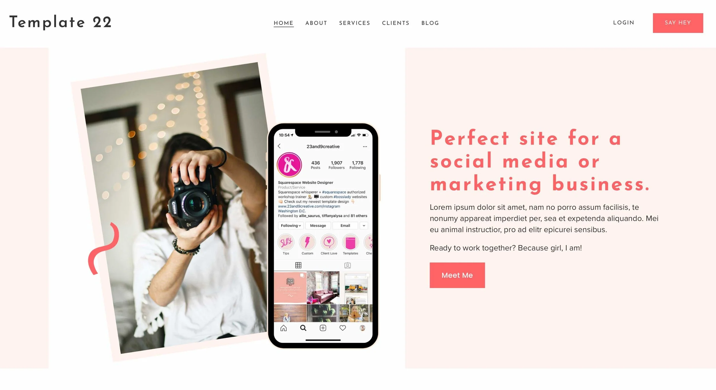
There are websites that look expensive. Not because they are covered in animations. Not because they use black backgrounds, enormous photographs or some fashionable new typeface. And not necessarily because someone spent tens of thousands designing them.
They simply look considered.
You can often spot the difference within seconds. One website feels as though somebody made hundreds of small decisions on purpose. Another feels as though somebody opened a template, changed the logo and started filling in the boxes.
That distinction matters.
A website is often the first place a potential customer encounters your business. Before they have read your credentials, checked your reviews or spoken to you, they are already making assumptions about how professional, established and trustworthy you are.
The good news is that making a website feel more expensive doesn't necessarily mean making it more complicated.
In fact, some of the most convincing improvements are almost ridiculously small.
Here are ten worth looking for.
1. Make the edges line up
This sounds boring.
It is also one of the quickest ways to make a website feel professionally designed.
Look at the left and right edges of your page. Does the heading line up with the paragraph beneath it? Does the next section begin on the same visual axis? Do images, buttons and text blocks feel as though they belong to the same underlying structure?
Good design often has an invisible skeleton.
You don't need to see the grid to feel it. Your eye simply registers that things are sitting where they ought to.
A common giveaway of a quickly assembled website is small inconsistencies: one section starts slightly further left, a button doesn't align with the text above it, an image is a few pixels wider than its neighbour.
Individually, none of these things matter.
Together, they create a sense that nobody was really checking.
Small fix: Pick two or three key alignment lines on each page and make sure the important elements respect them.
2. Stop treating every piece of text as equally important
One of the least expensive-looking things a website can do is shout everywhere.
Big heading.
Bold subheading.
Coloured button.
ALL-CAPS label.
Another bold sentence.
Another call to action.
When everything is emphasised, nothing is.
A sophisticated website usually has a clear pecking order. There is something you notice first, something you read second and plenty of information that can wait.
This doesn't mean making everything tiny and understated. Quite the opposite.
It means allowing the important things to be confidently important.
Think of a good restaurant menu. You don't expect every dish, price and description to be screaming at you. The hierarchy does the work.
Your website needs the same discipline.
3. Give buttons somewhere to live
A surprisingly small detail: the space around a button.
A button jammed against a paragraph feels like an afterthought.
A button with a little breathing room feels intentional.
The same applies to navigation links, form fields, image captions and icons.
You can have exactly the same button in exactly the same colour and make it feel considerably more polished simply by giving it the right amount of surrounding space.
There is another useful trick here: don't make every button look like the most important button on the page.
If “Contact us”, “Learn more”, “View services”, “Download our guide” and “Book now” all have identical visual weight, the visitor has to work out what matters.
Use your strongest button style for the action you most want someone to take.
Everything else can be quieter.
4. Use fewer icons — and make the ones you keep belong together
Icons are one of the easiest ways to accidentally make a website look like a template.
A row of generic little symbols can instantly give away the fact that a section was assembled from a page builder's component library.
This doesn't mean icons are bad.
It means they need a reason to be there.
If you use them, keep their visual language consistent. Don't mix a delicate outlined icon with a chunky filled one. Don't use an icon simply because there was an empty space next to the heading.
And don't assume every service needs its own symbol.
Sometimes a strong heading and a well-written sentence communicate more sophistication than six decorative graphics.
A useful test: remove all the icons from a section. If the section becomes clearer, leave them out.
5. Pay attention to the tiny bits of text
The smallest words on a website can have a surprisingly large effect.
Labels above headings.
Form instructions.
Navigation items.
Image captions.
Phone numbers.
Opening hours.
Footer text.
These are rarely the stars of the page, but they are everywhere.
When they have inconsistent capitalisation, awkward spacing or different tones of voice, the website starts to feel assembled rather than designed.
Compare:
OUR SERVICES
Our services
Services
WHAT WE DO
None is automatically right. The important thing is that the choice feels deliberate and is repeated consistently.
Premium design isn't about finding the magic font size or capitalisation rule.
It's about making a decision and sticking to it.
6. Don't let your images fight your layout
You don't necessarily need expensive photography.
You do need photographs that behave well on the page.
A beautiful image can still make a website look amateur if it is cropped awkwardly, squeezed into the wrong aspect ratio or surrounded by images with completely different visual treatments.
Think about your images as a collection rather than individually.
Do they have a similar feel?
Do they share a sensible crop?
Are some bright and some dark for no obvious reason?
Are faces being cut off at strange points?
Does one image look like a professional photograph while the next looks like a rushed phone snapshot?
You can often improve an existing website without replacing a single photograph simply by re-cropping and re-sequencing the images.
That is an almost invisible change.
And invisible changes are often the best ones.
7. Let one element be slightly unexpected
Here is where “expensive” design differs from simply “minimal” design.
A premium-looking website doesn't have to be bland.
In fact, if everything is perfectly predictable, it can feel just as generic as an over-designed template.
The trick is to have one memorable detail.
Perhaps the navigation changes slightly when you scroll.
Perhaps a photograph overlaps two sections.
Perhaps a heading sits somewhere you don't quite expect.
Perhaps there is an unusually generous image treatment or an interesting piece of microcopy.
The important word is one.
A distinctive detail works because everything around it gives it room.
If every element is trying to be the memorable element, the result is visual noise.
Think of it as the design equivalent of wearing one excellent piece of jewellery rather than every piece you own at once.
8. Make your mobile version feel designed — not merely squeezed
This is one of the biggest tests of whether a website has actually been considered.
A desktop layout can look fantastic at full width.
Then you open it on a phone and discover:
headings wrapping onto strange lines
buttons sitting awkwardly beside text
enormous gaps
tiny text
images cropped at the wrong point
navigation that feels like an obstacle course
A genuinely polished website isn't simply responsive.
It feels native to the screen you're using.
Mobile may require different spacing, different image crops, different line breaks and sometimes a different order of information.
This is particularly important for small businesses because your customer may never see the desktop version.
They may meet your website for the first time through a Google search on their phone.
If that experience feels effortless, your business immediately feels more competent.
9. Remove the things that don't earn their place
This may be the most powerful detail of all.
Look at your homepage and ask:
If I deleted this, would the visitor lose anything important?
A testimonial carousel that nobody reads?
Gone.
Three badges explaining something your copy already explains?
Gone.
A second “Get in touch” button five inches below the first?
Gone.
A paragraph that says essentially the same thing as the heading?
Gone.
A decorative divider between every section?
Probably gone.
Good design isn't only about adding polish.
It is about editing.
The more confident a website becomes about what matters, the less it needs to fill every available space.
And this is particularly useful when working with a website template. A template gives you the structure; your job is not to fill every box simply because the box exists.
10. Make the footer feel like the end of something
The footer is often treated as the place where websites go to die.
Logo.
Address.
Social icons.
Legal links.
Maybe a newsletter form.
Everything gets squeezed into the bottom of the page and forgotten.
But a good footer can quietly reinforce the quality of the whole site.
It should feel like a proper conclusion.
Give the information enough room. Keep the hierarchy clear. Make contact details easy to find. Don't add ten links just because there is space for them.
For a small business, the footer can also be reassuringly human.
A real location.
A proper email address.
A telephone number.
Opening information.
A concise final invitation to get in touch.
The details tell the visitor that there is an actual business behind the screen.
And that matters more than another decorative flourish.
The expensive-looking website isn't necessarily the expensive website
This is the bit worth remembering.
A website can cost thousands and still look strangely cheap.
Another can be built from a professionally designed template and look remarkably polished.
The difference is often what happens after the template.
The logo gets replaced, but the spacing isn't reconsidered.
The photographs get swapped, but their crops don't work together.
The business's own copy gets pasted in, but the hierarchy is left untouched.
Every available component gets used because it is there.
That is how a good starting point becomes an average website.
The alternative is much simpler.
Treat the template as the architecture, not the finished building.
Make the content yours.
Make the imagery coherent.
Check the alignments.
Edit the sections.
Give important things room.
Remove things that don't help.
Look at the site on a phone.
Then look at it again the next morning with fresh eyes.
That is where the “expensive” feeling tends to come from.
Not from adding more.
From making better decisions about what stays.
A final five-minute test
Before launching your website, turn your attention away from the big design questions and look for the small stuff.
Ask yourself:
Do things line up?
Is it obvious what I should look at first?
Are my buttons fighting each other?
Do my images look like they belong to the same business?
Is there anything on the page that I could remove without losing meaning?
Does the mobile version feel intentional?
Is there one detail I will actually remember?
If the answers are mostly yes, you are probably much closer to a premium-looking website than you think.
And you may not need a bigger website at all.
You may just need a more deliberate one.
Looking for a polished Squarespace starting point?
We offer professionally designed, ready-to-customise Squarespace websites for small businesses, with designs covering professional services, creative businesses, hospitality, wellness, property, weddings and more. The idea is simple: start with a strong design foundation, then make it genuinely yours rather than building every page from scratch.